Visualizing sar data
Hopefully you are now regularly collecting system statistics after reading Tomas Vondra’s defense of using sar. If you don’t have anything in place that readily visualizes the data, I have some examples that you can hopefully build off on to see everything you need to see.
In addition to sar, the sysstat package also has a utility called sadf to display collected data. Simply running sadf without any arguments will show you the recently aggregated processor utilization data resulting in:
gentoo 599 2017-05-25 17:10:01 UTC all %user 13.03
gentoo 599 2017-05-25 17:10:01 UTC all %nice 0.01
gentoo 599 2017-05-25 17:10:01 UTC all %system 5.16
gentoo 599 2017-05-25 17:10:01 UTC all %iowait 0.47
gentoo 599 2017-05-25 17:10:01 UTC all %steal 0.00
gentoo 599 2017-05-25 17:10:01 UTC all %idle 81.32
If you’re like a database, then you might prefer to consume that data in a different format by using the -d flag, which will pivot the data onto a single line resembling CSV formatted data that looks like:
# hostname;interval;timestamp;CPU;%user;%nice;%system;%iowait;%steal;%idle
gentoo;599;2017-05-25 17:10:01 UTC;-1;13.03;0.01;5.16;0.47;0.00;81.32
But if your monitor is too small to see more than few hours of data without scrolling back and forth, or if you prefer to visualize it in another way then the database friendly format of the data can be feed into gnuplot, a simple graphing utility.
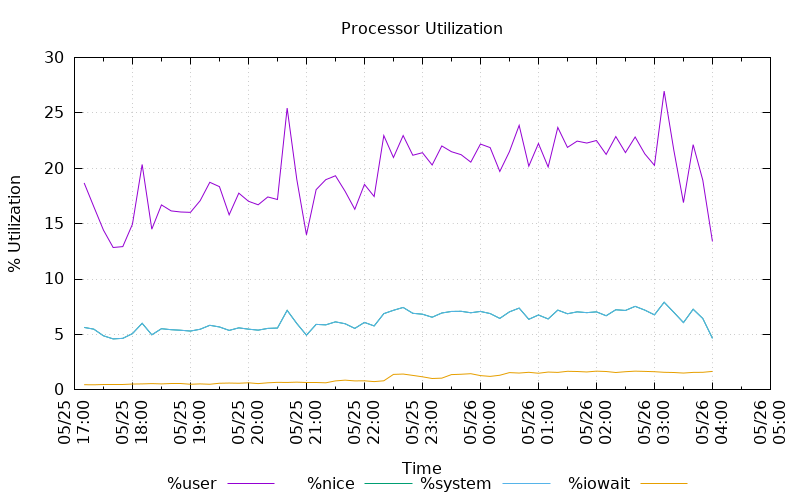
The graph above is produced from the following set of commands that describe that data format, sets the plotting details, and sums the data from the sadf output in order to produce a stacked line chart. This is just one example of how plots may be produced with gnuplot.
datafile = "sar.dat"
set datafile commentschar ""
set title "Processor Utilization"
set xdata time
set timefmt "%Y-%m-%d %H:%M:%S"
set datafile separator ";"
set terminal pngcairo size 800,500
set output 'sar.png'
set xlabel "Time"
set ylabel "% Utilization"
set xtics rotate
set key below
set grid
plot for [i=5:8:1] \
    datafile using 3:(sum [col=i:8] column(col)) \
    title columnheader(i) \
    with lines
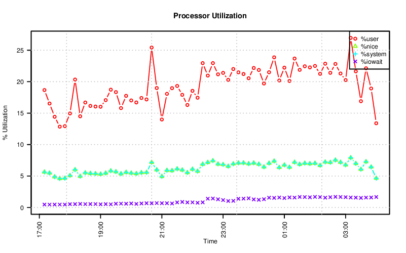
I have a fondness for R, software for statistical computing and graphics. It might not be as easy to get started with as gnuplot, but please try it out if you have an opportunity. Like gnuplot, it can be used to produce a similar chart.
There are a few more commands for R (and perhaps I could use some R tips), but the idea is the same as the gnuplot commands above.
df <- read.csv("sar.dat", sep = ";", header=T, comment.char = "")
df$timestamp <- strptime(df$timestamp, "%Y-%m-%d %H:%M:%S")

type <- c("X.user", "X.nice", "X.system", "X.iowait")
label <- c("%user", "%nice", "%system", "%iowait")
color <- rainbow(4)
pch <- seq.int(1, 4)

bitmap("sar-R.png", type="png16m", units="px", width=800, height=500,
       res=150, taa=4, gaa=4)

for (i in 3:1) {
    df[[type[i]]] <- df[[type[i]]] + df[[type[i+1]]]
}

par(las=2)
plot(df$timestamp,
    df$X.user,
    type = "b",
    col = color[1],
    ylim = c(0, max(df$X.user, na.rm = T)),
    main="Processor Utilization",
    xlab="Time",
    ylab="% Utilization")

for (i in 2:4) {
    points(df$timestamp, df[[type[i]]], type = "b", pch = pch[i],
           col=color[i])
}

legend('topright', label, pch=pch, col=color)
grid(col="gray")
dev.off()
As a reminder, this isn’t limited to just the aggregated processor utilization. You can also visualize the individual processor statistics, statistics from storage devices, memory utilization, network usage and more. Nor is this data limited to being visualized by gnuplot or R.


